


Elevating the Digital Experience in Hospitality
Runtriz delivers mobile solutions that transform hotel operations and guest interactions. Stepping into this project, my goal was to refine and unify the brand’s visual identity across all platforms. With a strong emphasis on consistency, I developed structured branding guidelines that informed the design of web pages, promotional assets, and social media content.
A major focus was enhancing the website’s landing page to better showcase Runtriz’s technology and value proposition. Through strategic design decisions and cohesive marketing materials, I helped create a polished, engaging brand presence that resonates with both hotel partners and their guests.

PROBLEM
Runtriz faced a significant challenge with their brand identity. Despite having an existing logo, they only possessed a brief 4-page brand identity document that lacked detailed guidelines and failed to provide sufficient direction for consistent branding and style. This insufficiency resulted in inconsistent branding efforts and a diluted brand presence across various digital and print platforms for their website and engagement assets.
PREVIOUS RUNTRIZ BRAND GUIDELINES


EXPLANATION
To address this issue, I undertook a project to expand their brand identity by adding detailed color palettes for both digital and print use, establishing clear design guidelines, and creating cohesive marketing campaigns. This work ensured that Runtriz could present a unified and professional image across all touchpoints, enhancing their brand recognition and effectiveness.
COLOR PALETTE
While Runtriz had an existing color palette, they lacked guidelines on correct color usage for logos, combinations, hierarchy, and layout. I expanded their color usage by creating visual examples and developing a comprehensive guideline to ensure consistent and proper application across all branding materials.
primary colors

Secondary Colors

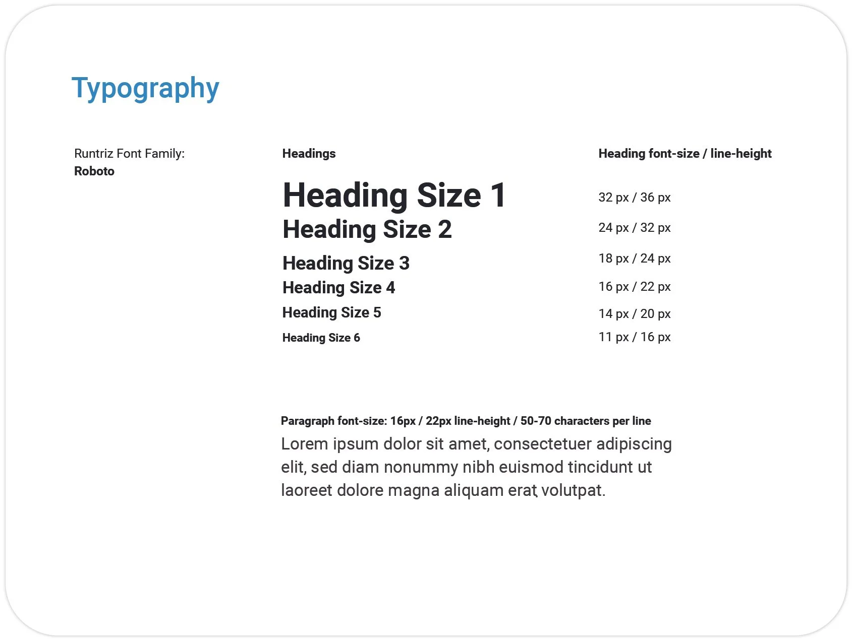
TYPOGRAPHY
The original Runtriz guidelines utilized the Roboto typeface but only included examples of headings without clear direction on usage or specifying the different font styles available within Roboto. The guidelines merely provided heading sizes, offering limited instruction on implementing the brand identity effectively.
Roboto Font Family Usage

logo layout + Correct Color Usage
Below are the correct color combinations and placement for the Runtriz logo.
I've developed a balanced logo version optimized for use in scenarios requiring compact width, such as conference materials or centered design layouts. The previous stacked logo had a disproportionately large Runtriz emblem and a small typeface.

BRANDED SOLUTION ICONS
I created visual icons to represent each solution for the Runtriz Platform using thick black strokes and the primary brand colors.
UI MOBILE MOCK UPS
I designed visual representations of the mobile user interface to showcase the diverse solutions we can implement in a hospitality app. The goal was to extend Runtriz’s branding theme and clearly present our solutions to the audience.


WEB LAYOUT LANDING PAGE
After refining the brand guidelines, I focused on revisiting and enhancing the Runtriz home page. My project involved refining, restructuring, and simplifying the website. Collaborating closely with the General Manager and CEO, we incorporated industry best practices for CTAs and design, ensuring a user-friendly experience that effectively drives engagement and conversions.
tools used: figma, illustrator, photoshop, & wix


MOBILE ORDERING AD CAMPAIGN
We ran a campaign to promote the Mobile Ordering platform, which resulted in a 5% increase in lead generation to the Runtriz website and boosted participation in our live demo calendar.
tools used: linkedin ads, google ads, google analytics, illustrator, photoshop


CLIENT WEB APP IMAGE ASSETS
Below are digital assets that were used to help clients promote their web or native app for their marketing initiatives.
tools used: photoshop, lightroom


BLOG PUBLICATION
I helped support the marketing team by reviewing, finalizing, and posting technical papers and blogs.

Runtiz Blog Publication by Renz Ganaban
PROMOTIONAL CONTENT
Below are promotional videos that explain an introduction of Runtriz and their solutions.
tools used: premiere pro, canva
PRINT DESIGN
LINKEDIN SOCIAL LAUNCH POSTS
CONFERENCE DISPLAYS


